
Statement with a Message (Part 4)
Exhibition posters – they spark people’s interest in upcoming exhibitions and eventually become collector’s items themselves. Not only do they advertise events and activities, they also reveal a lot about a museum’s self-image – and the same holds true for the Bauhaus-Archiv.
Part 4 of the series “Our History” takes you on an introductory tour of our poster collection which dates back to 1961.
Lorem ipsum
-
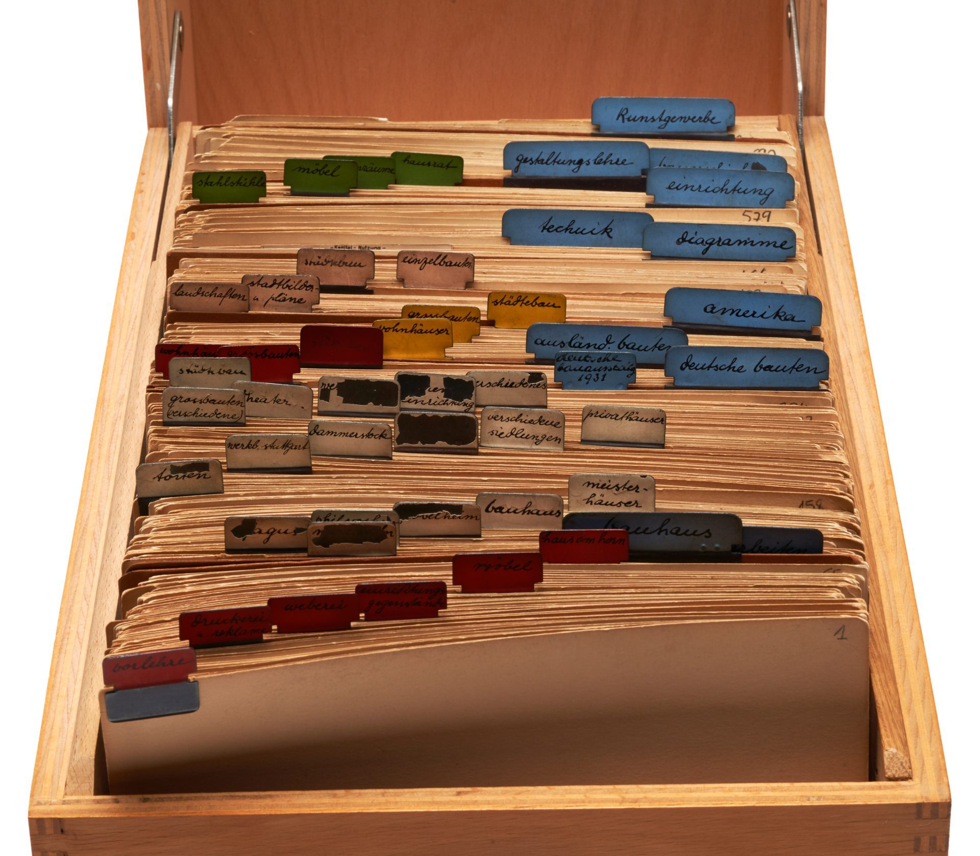
A very special collection at the Bauhaus-Archiv documents the active exhibition activities of the museum. Over the past 61 years since its founding, the Bauhaus-Archiv / Museum für Gestaltung has organised 250 exhibitions. That’s an average of four presentations every year. Each of these exhibitions was announced with a poster which advertised the event with a specific image. One copy of every poster was preserved in the collection of the Bauhaus-Archiv. Meanwhile, some 250 prints now comprise an autonomous group of works which, at closer inspection, reveals how the museum began with largely the support of friends and acquaintances and has since evolved into a modern museum.
Old acquaintances
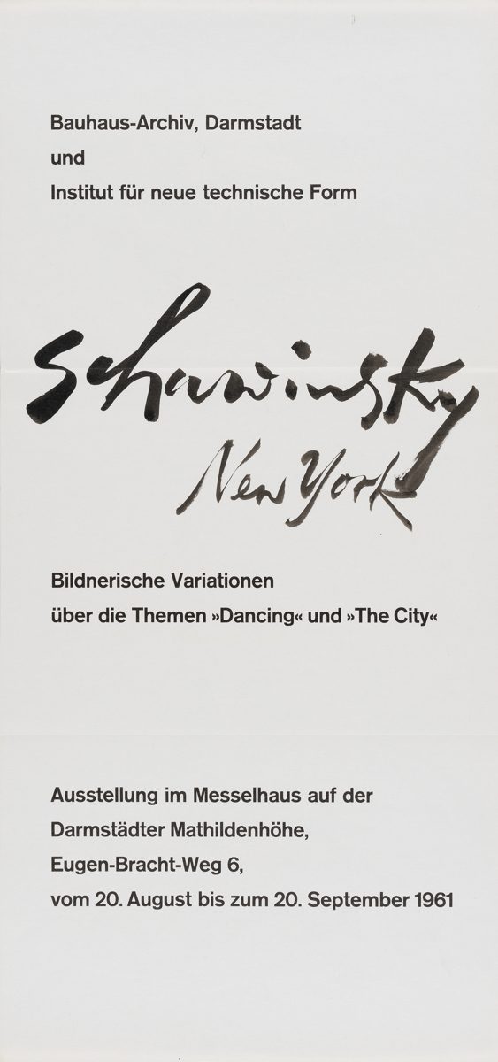
In the early years of the Bauhaus-Archiv in Darmstadt, there was still a palpable connection to the former students and staff of the Bauhaus, and museum curators consciously emphasised the archive’s connection to these well-known designers. The first two exhibition posters with their quietly proud, austere look, refrained from using any imagery at all. The first from 1962 simply bears the striking handwritten title “Schawinsky New York” in black against a white background. The exhibition presented the works of Xanti Schawinsky (1904–1979), the former Bauhaus student and later instructor for stage design in New York who, by that time, was living in Switzerland. Two years later, a poster, the designer of which remains unknown, features the name of the former Bauhaus instructor Georg Muche (1895–1987). At least in this case, the red lettering suggests the prominence of the almost 70-year-old artist who had most recently worked in Krefeld. Not only do both posters noticeably lack imagery, they also stand out for their DIN A2 format; almost all the other posters are larger (DIN A1) with only a few printed on the even larger A0 format.
Lorem ipsum
-
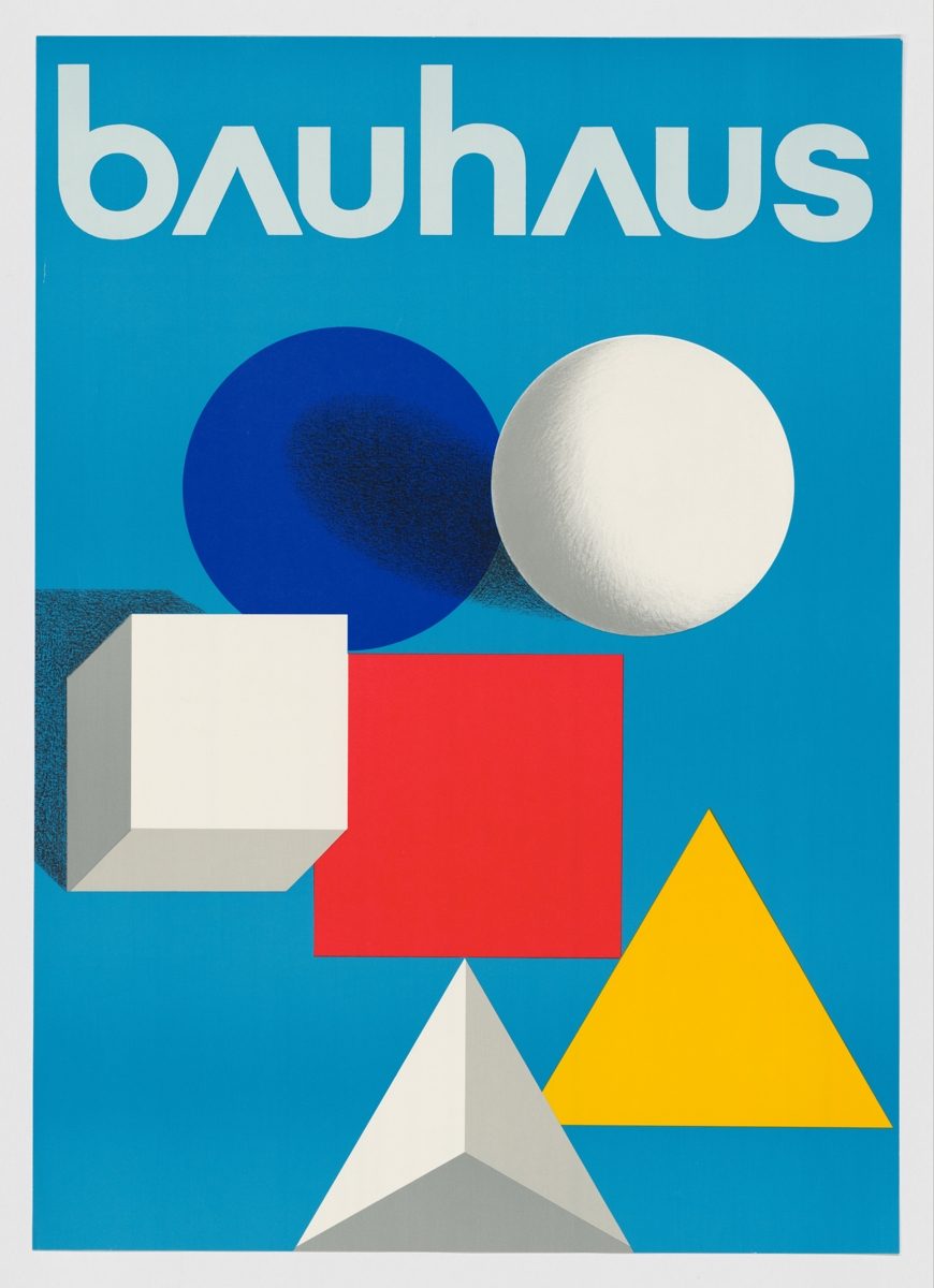
For the 1968 exhibition “50 Years of the Bauhaus” commemorating the 50th anniversary of the Bauhaus and organised by the Institute for Foreign Relations in cooperation with the Bauhaus-Archiv, a poster was designed by a prominent former member of the Bauhaus, Herbert Bayer (1900–1985). His design depicts the basic shapes and colours which many people today almost reflexively associate with the Bauhaus. Bayer, who had managed the printing and advertising workshop at the Bauhaus Dessau from 1925 to 1928 and was then working in New York, is also credited with designing the signet of the Bauhaus-Archiv. The poster was an incredible success. After its debut at the Württembergischer Kunstverein in Stuttgart, the exhibition went on tour to Paris, Barcelona, Chicago and Buenos Aires where it was adapted to each location and whose aesthetics strongly influenced the international perception of the Bauhaus legacy.
Lorem ipsum
-
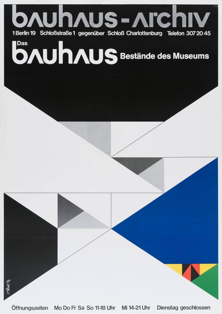
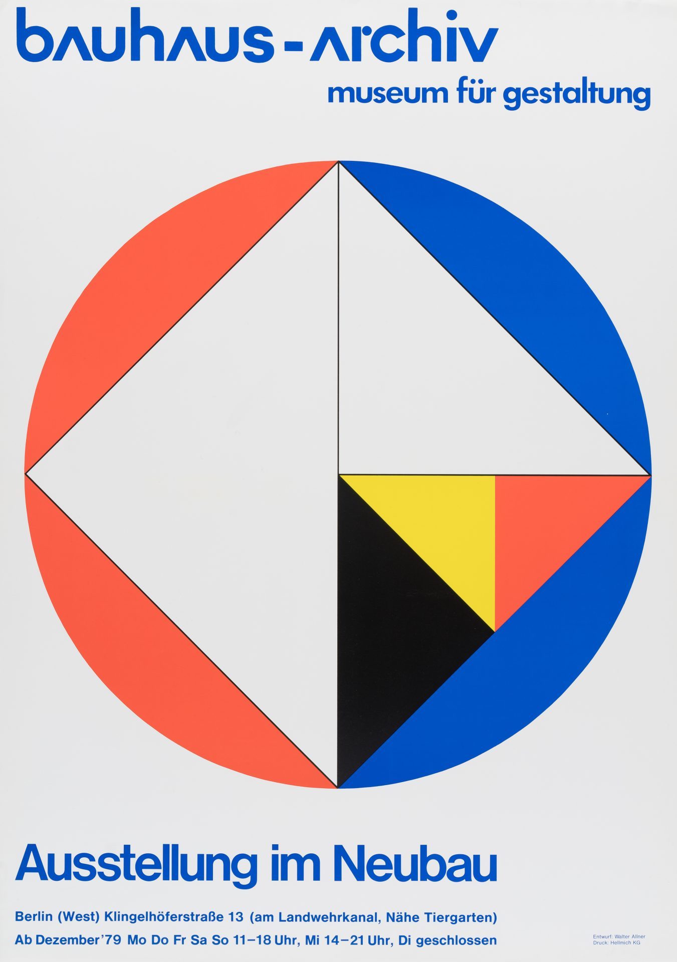
Shortly after the Bauhaus-Archiv arrived in Berlin in 1972, Walter Heinz Allner (1909–2006), who had studied at the Bauhaus from 1927 to 1930 and was then living in the United States, created two poster designs which referred to the instruction at the school. Both posters feature the basic shapes and colours of the Bauhaus. The first highlights the “Museum Holdings” in the 1970s, while the second, “Exhibition in the New Museum” from 1979 recalls the most famous design exercises of the Bauhaus.
Continued inspiration
The exhibition posters of the 1980s reflect how fundamentally important typography and graphic art were in building identity at and for the Bauhaus. Especially László Moholy-Nagy, Joost Schmidt, Josef Albers and Herbert Bayer inspired many of the poster designers of the younger generation who were commissioned by the Bauhaus-Archiv. For example, some posters share qualities with Bayer’s own poster which he made for the exhibition “European Art and Design” presented at Leipzig’s Grassimuseum in 1927. It features Bayer’s characteristic pattern of squares and letters. Some of the more recent posters also incorporate the universal typography which Bayer developed for the Bauhaus communications department between 1925 and 1930.
Lorem ipsum
-
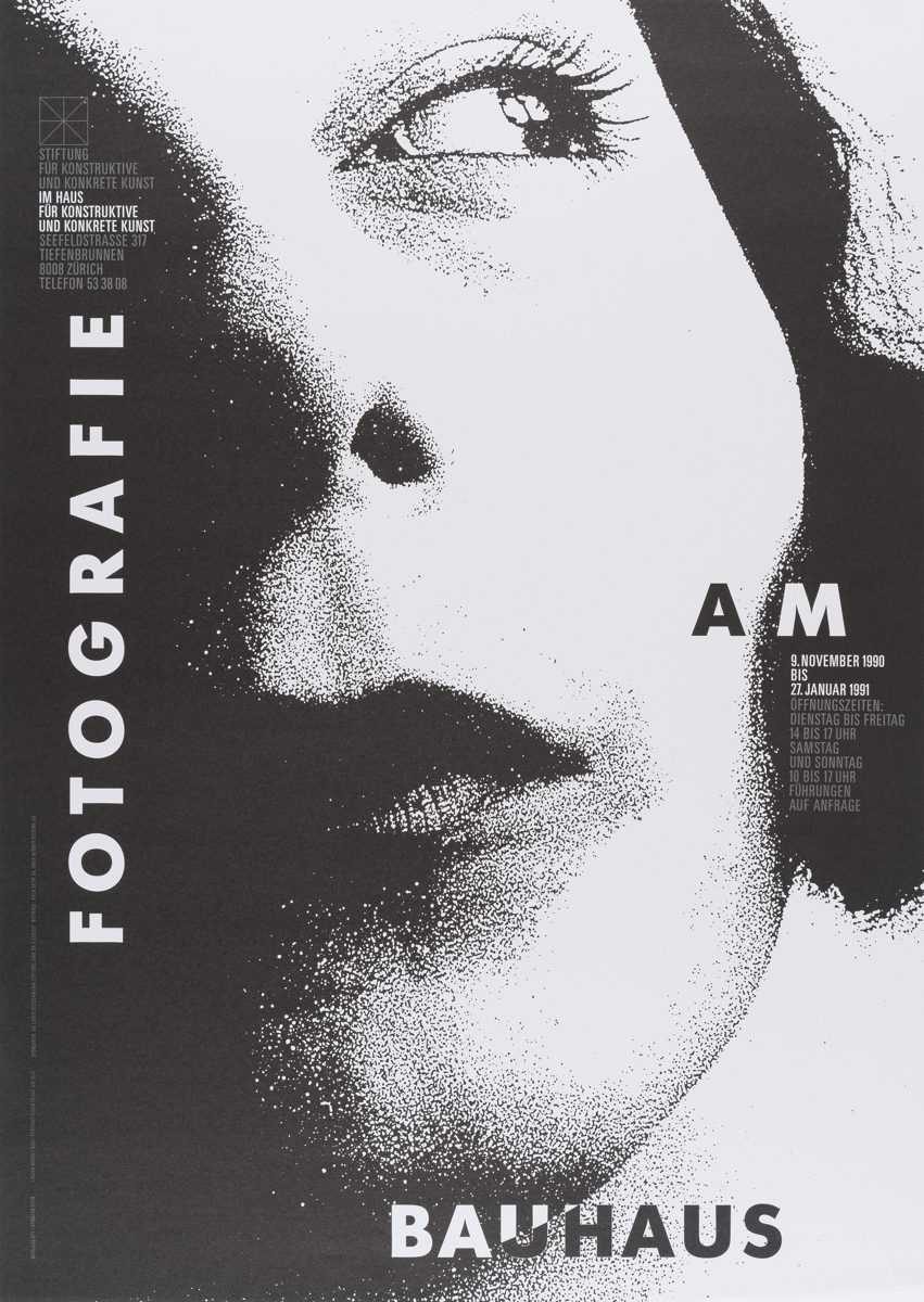
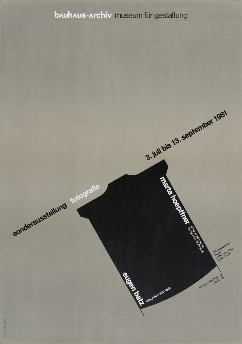
Numerous exhibition designers played with historical references, but only few graphic designers made a name for themselves by the sheer number of posters they created for the Bauhaus-Archiv. This particularly applies to the Berlin design firm Ott + Stein. Its founders Nikolaus Ott (born 1947) and Bernard Stein (born 1949) managed the company between 1978 and 2004 and designed communication materials for numerous museums. They produced some 20 posters for the Bauhaus-Archiv, all of which were successful at attracting attention in Berlin’s urban landscape. These include the cleverly embedded image of a camera for the exhibition “Marta Hoepffner” in 1981, and the photo detail for the special exhibition “Photography at the Bauhaus” in 1990, which plays with black-and-white dichotomy, diagonals, perspectives and sequences of perception.
Lorem ipsum
-
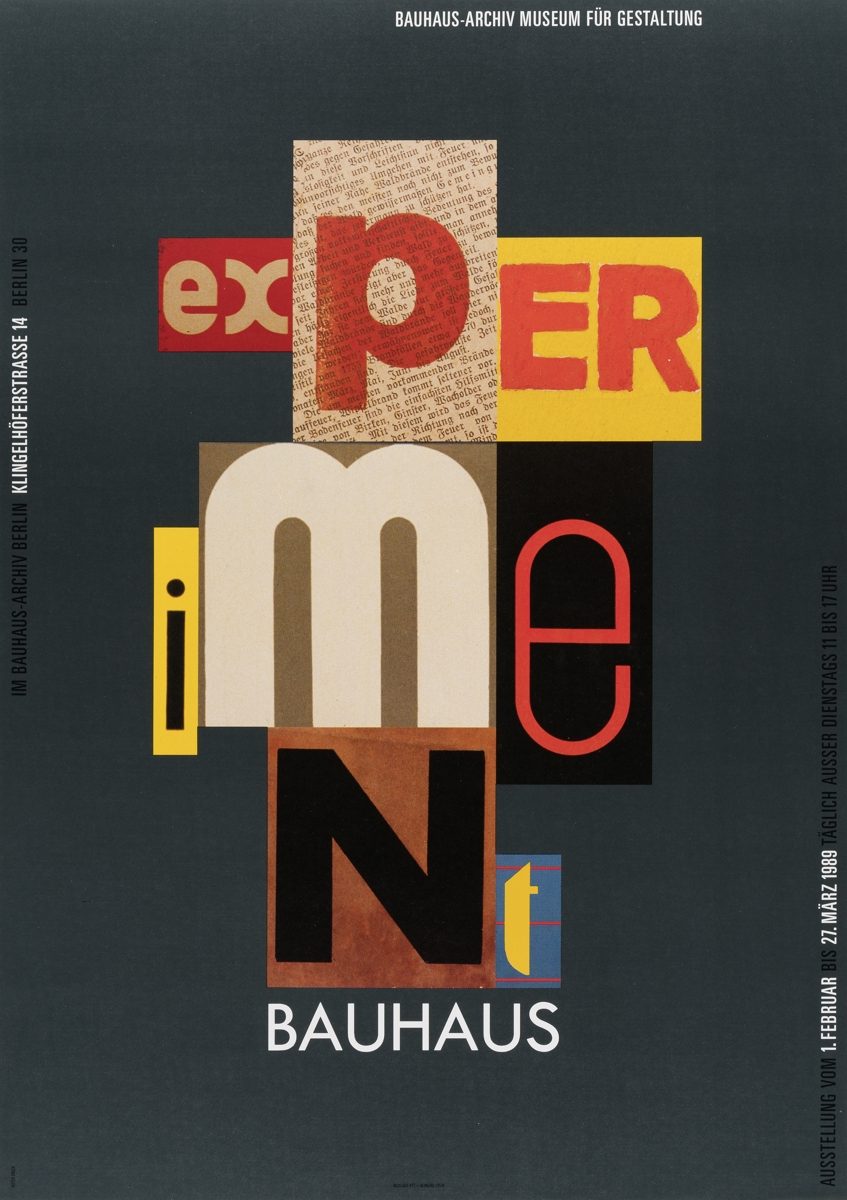
For the exhibition “Bauhaus Experiment” in 1989, Ott and Stein varied typographies and colours to correspond to the respective theme. The result is a subtle reference to the complex poster that the Bauhaus instructor Joost Schmidt designed for the Bauhaus Exhibition in 1923. Ott + Stein also produced elegant poster designs featuring painted and metal works and striking motifs with a recognition effect, e.g. a series of human-sized posters from 2003 depicting the distinctive shed roofs of the Bauhaus-Archiv designed by Walter Gropius. Herbert W. Kapitzki (1925–2005), professor at the State University for the Visual Arts in Berlin, produced a poster in 1977 advertising the exhibition “Art School Reform 1900-1933”, which is based on Joost Schmidt’s designs of Bauhaus print materials from the 1920s.
Lorem ipsum
-
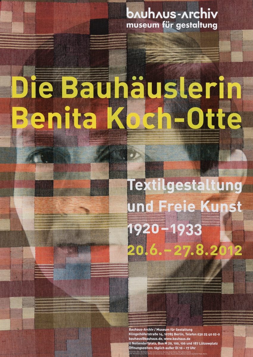
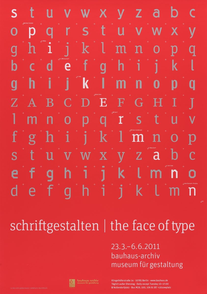
In the lead-up to the 1987 commemorative exhibition “New Bauhaus” which shed light on the artistic successor to the Bauhaus in the Chicago, the poster by Gabriele Franziska Götz (born in 1954) featured an interesting, dual perspective: It established a connection between the formally distinctive photo from the late 1930s in Chicago with typography reminiscent of the Bauhaus Exhibition catalogue of 1923. The Berlin-based Atelier Frank went a step further in its poster for the exhibition on the “Bauhäuslerin Benita Koch-Otte”. The design interwove photography, colours, a grid pattern and typography to create a condensed image evoking the textile designs featured in the exhibition. Other featured artists occasionally chose to design posters for their own exhibitions, such as Erik Spiekermann (born in 1947), who also incorporated the grid as a design element and his highlighted name for the exhibition “Spiekermann – schriftgestalten / the face of type”.
Lorem ipsum
-
Blank spaces
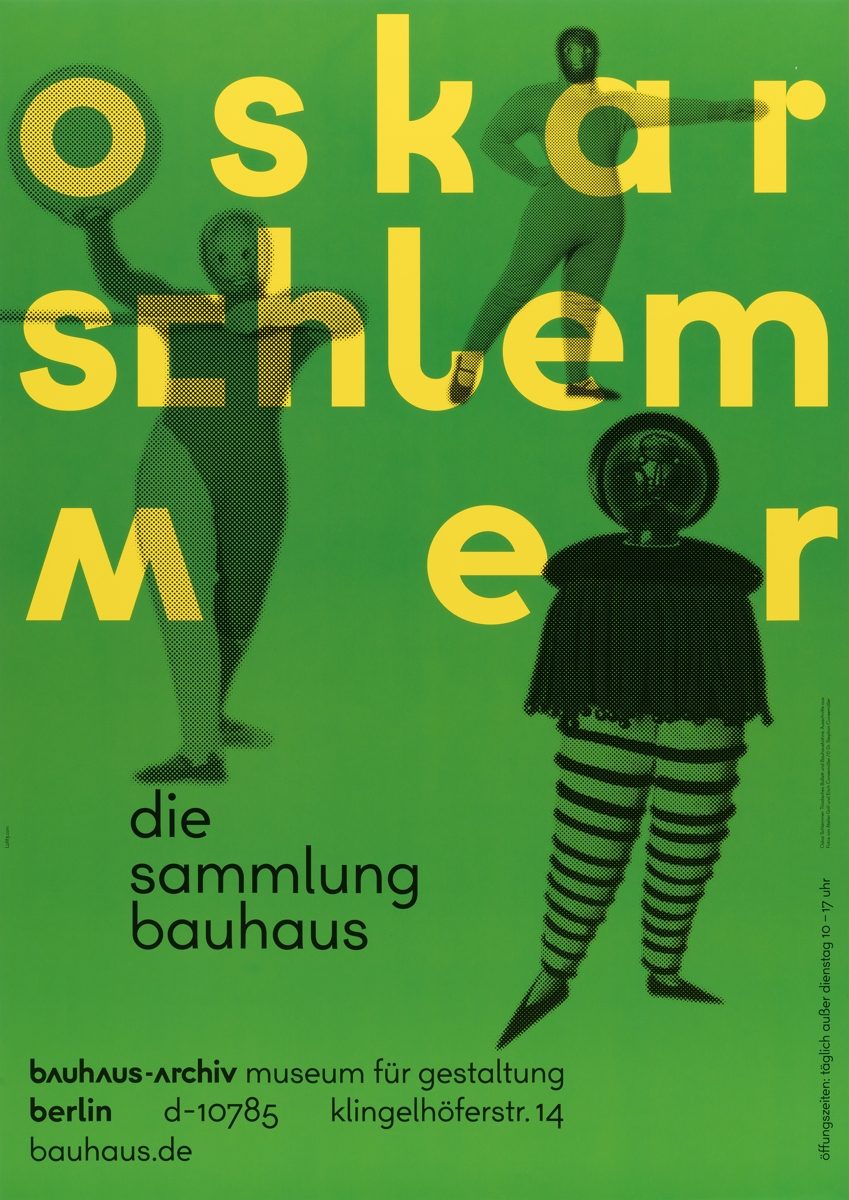
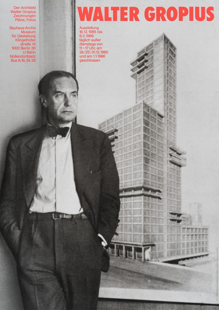
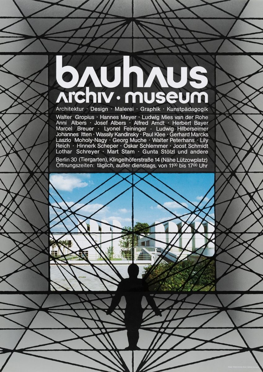
Human beings are strangely absent in the posters of the Bauhaus-Archiv. Public space abounds with advertisements depicting faces which immediately attract our attention. And yet in all these years, the Bauhaus-Museum printed only about a dozen faces on its posters. Far more frequently, the posters tended to portray the collection holdings of the museum, architectural depictions and classical designs, whereby a central exhibit would take up most of the space and the information about the exhibition would be printed on a neutral background or superimposed across the photograph. Wieland Schütz (born in 1938) was one of the few designers who made the human figure a focal point of his posters. In the 1980s, he depicted someone symbolically entangled with the Bauhaus-Archiv. Inspired by Oskar Schlemmer’s theatre figurines, the person stands in the centre of a web connecting Bauhaus references to the museum and its collections. Schütz’s poster for the Gropius exhibition in 1985 depicted the architect himself on equal footing with his work.
-
Creating a brand
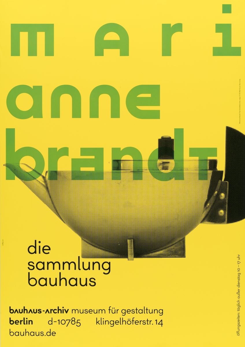
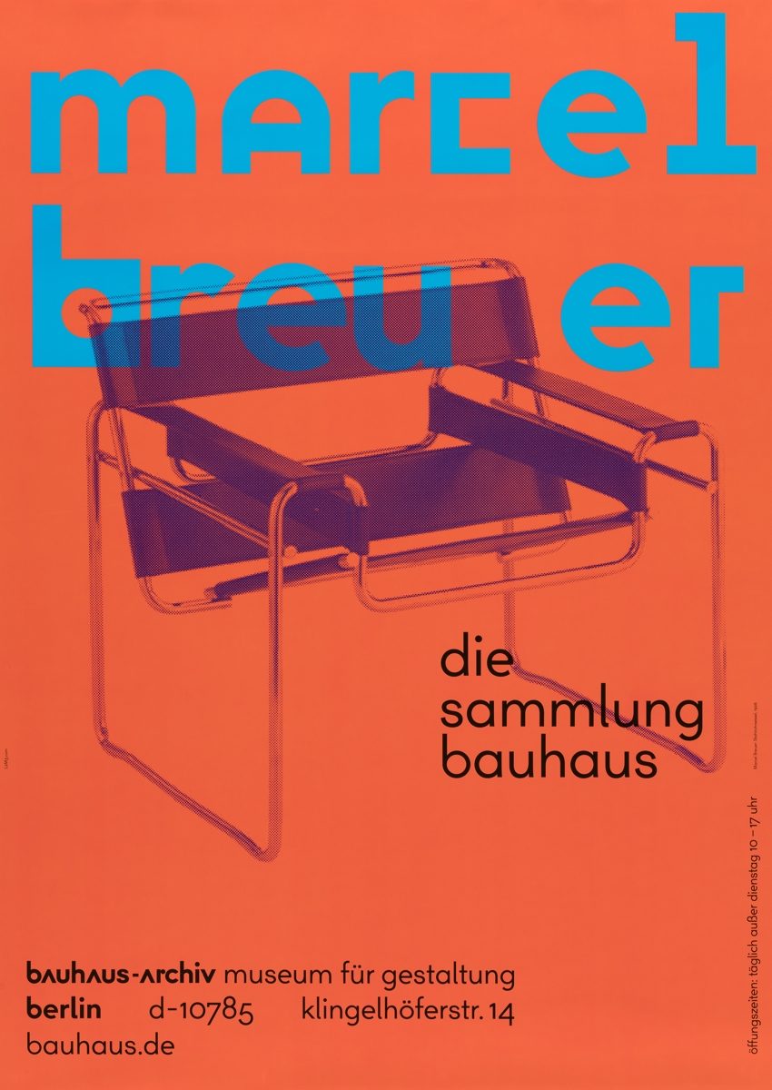
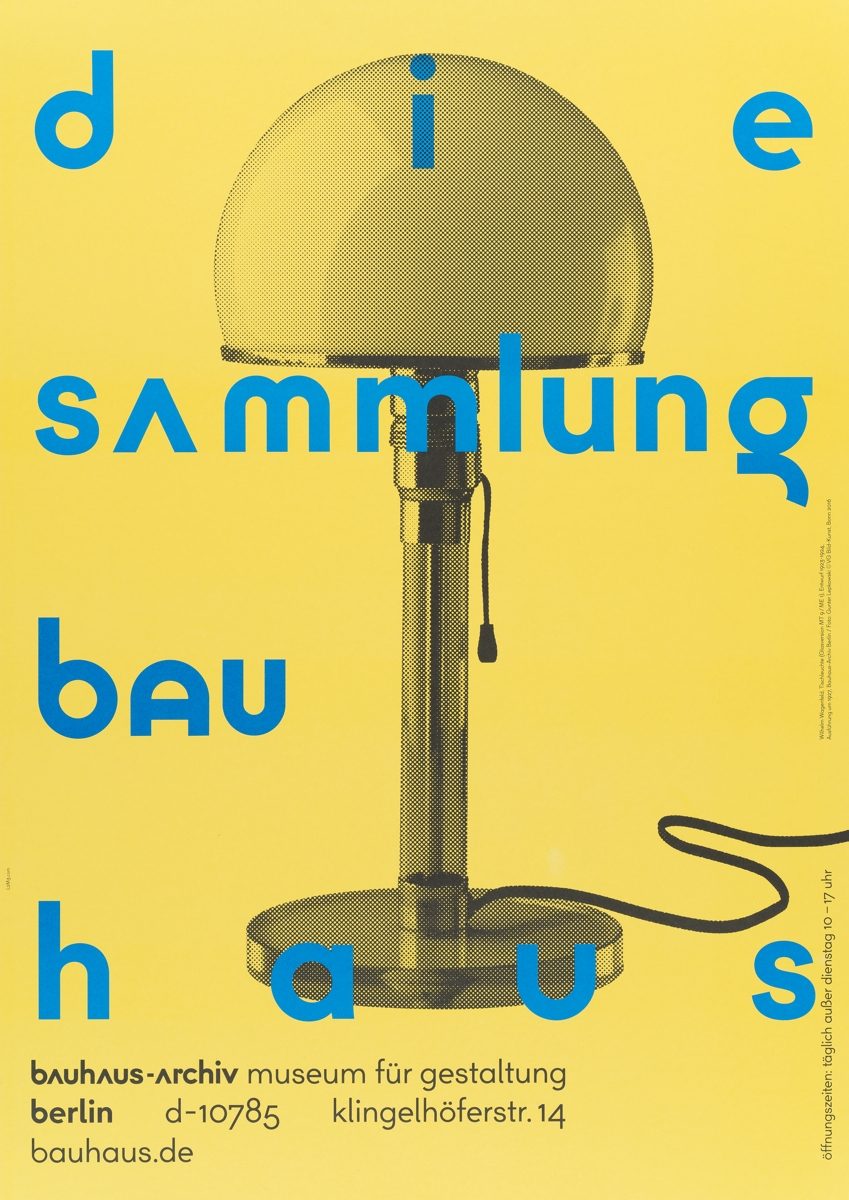
Apart from exhibition posters, the Bauhaus-Archiv also produced a number of museum, event and collection posters which further enhanced its profile in Berlin. In the 1990s, the Berlin graphic design firm Doppelpunkt created a museum poster based on Bayer’s universal alphabet, which was nominated in 1996 as one of the “100 Best Posters”. The distinction was garnered again in 2014 for the series of collection posters by the L2M3 design agency. The Stuttgart-based graphic designers, who were responsible for the general communication design of the Bauhaus-Archiv, created a four-part poster series featuring objects from the collection. The posters are characterised by strong monochromatic colours and highly contrasting typography, each comprising a prominent name and prominent work. Such collection highlights like the “Breuer chair” and the “Brandt teapot” became an integral part of the Bauhaus-Archiv brand.
L2M3, posters presenting highlights of the Bauhaus-Archiv collection